MIZAN · The Workbench

Good tools. Free. No catch attached.

Everything here is free. The engine upstairs is why we can afford that.

We publish free tools on TradingView and thinkorswim — every one of them open source — because reputation should be earned in public. Each one does one job well, says plainly what it can’t do, and never asks for your email. The paid engine is MIZAN — these are the workbench.

For the code readers. When a tag below says open source, it means the whole thing: the Pine is public on the TradingView Profile, and every thinkScript is a plain-text download you can open before you run it. Traders audit the tools. Skeptics audit the Builder. Either way the answer is the same: read the source.

The TradingView Profile → · The Builder →

A shelf of ways to read the tape. Zero ways to blame the tools.

First visitGrab one tool and trade it for a week before adding another. Choice paralysis is also a form of overtrading.

45+hours of unedited live tapewatch it yourself →
20free tools · all open sourceread every line before you run it

Educational tools shown with historical examples — not financial advice. Trading involves substantial risk of loss, and past performance does not indicate future results.

For TradingView · Pine Script

Each card links to its TradingView page; add it to your chart from there. Every chart zooms on tap.

Liquidity · Breadth · Lower pane · Open source · Live

Composite Liquidity Flow

AsksWhere is the whole market’s money leaning?

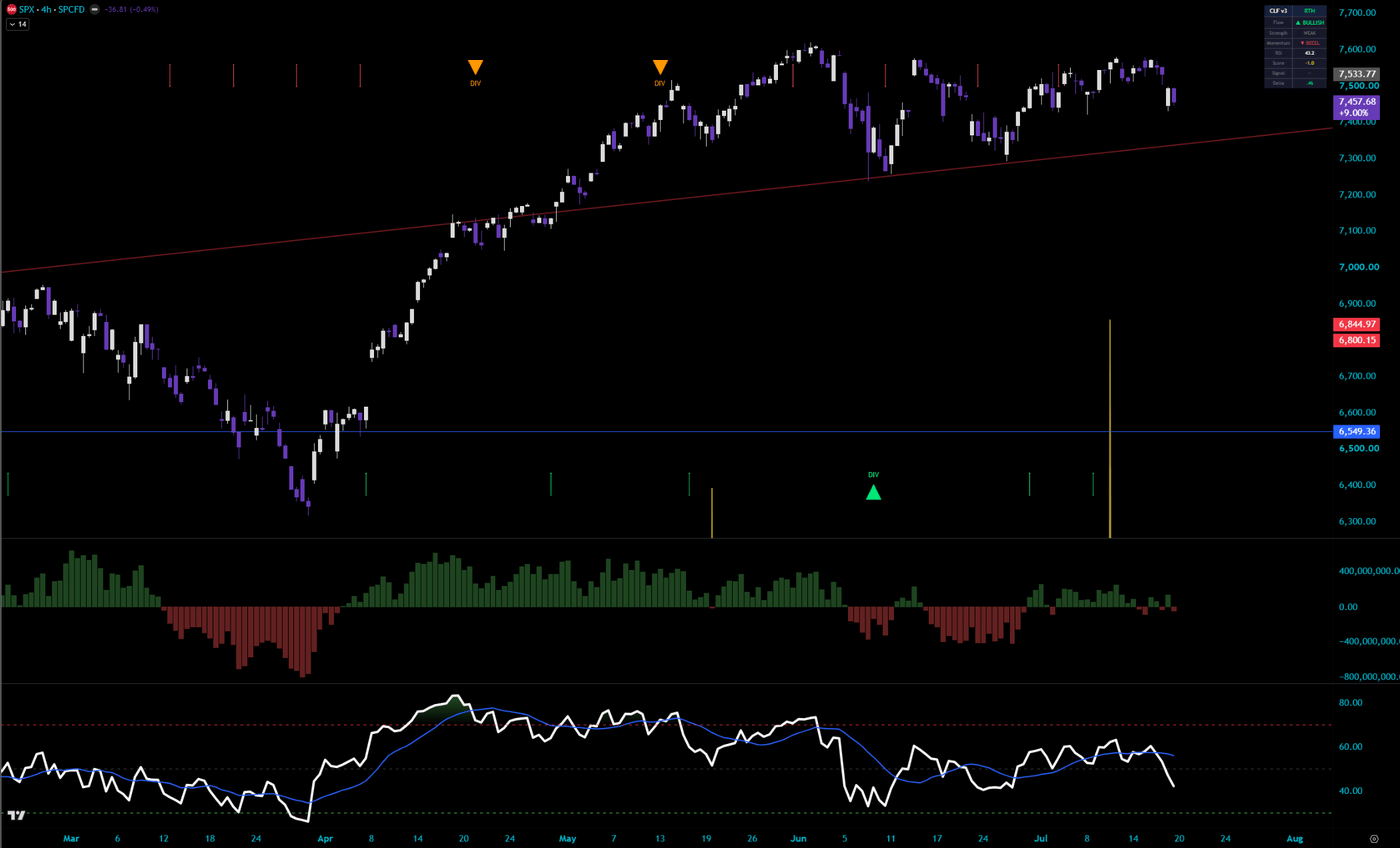
One histogram that answers where the whole market’s money is leaning. It estimates buy and sell pressure across five instruments at once: index futures, their ETFs, and an inverse hedge ETF flipped so its buying counts as market selling. Every leg is scaled by its own relative volume before it is combined, so futures contracts and ETF shares are not mixed as if they shared a unit, and legs with no data drop out of both the numerator and the denominator. The net is weighted, smoothed, and z-scored into a single pane with an RSI filter on top. Agreement markers print only when flow, its slope, breadth across the legs, and the filter all point the same way; divergence marks compare confirmed price pivots, not rolling ranges. All of it is estimated from OHLCV: a careful proxy, not tick data. It reads the index complex, not your single stock.

Plain EnglishIf the futures, the index ETFs, and the inverse hedge all lean one way at the same time, that lean is the whole market talking.

Composite Liquidity Flow under an SPY 15-minute chart: the five-asset weighted flow histogram, momentum line, divergence marks, and the dashboard reading direction, strength, breadth and 5 of 5 legs live

Get It Free on TradingView →

Liquidity · ICT · Sessions · Open source · Live

Daily Sweep Pro

AsksWas that dip a trap for stops?

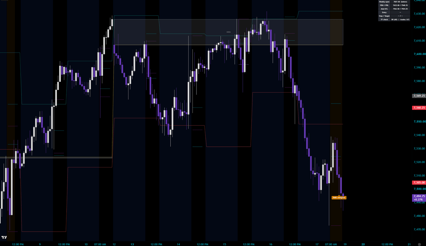
A full top-down liquidity playbook on one chart: daily-structure bias, a raid on a real liquidity pool against that bias, a fair value gap for confirmation, then an armed entry with the sweep as the stop and the prior-day level as the target. An AMD weekly-open filter, a reward:risk gate, and a daily circuit breaker keep it honest. Fires on closed bars only.

Plain EnglishPrice pokes below an obvious low, fills a pile of stop orders, then snaps back. This tool marks that poke as the trap it was.

Daily Sweep Pro on SPY 15-minute: prior-day high and low, weekly open, the new-week opening gap box, session ranges, and the status table reading neutral, no daily control

Get It Free on TradingView →

Order flow · Delta · Lower pane · Open source · Live

Elite CVD

AsksWho is actually in control, buyers or sellers?

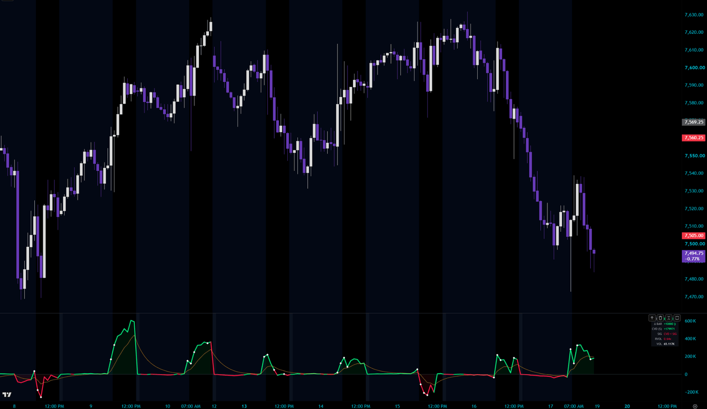
A cumulative volume delta pane that estimates who is actually in control. Context-aware wick attribution instead of naive 50/50 splits, session resets so today’s line is today’s flow, RVOL-weighted delta with spike dots, and pivot-based divergences that confess their own confirmation lag. With the volume weighting on, the running line is a weighted quantity rather than a literal contract count — the shape stays comparable, the units do not.

Plain EnglishEvery trade prints at the buyer’s price or the seller’s price. CVD keeps the running tally, so you can see who is really in control while the candles look identical.

Elite CVD under an SPX 15-minute chart: cumulative volume delta with its signal line, session resets, divergence marks and the live delta table

Get It Free on TradingView →

Breakouts · Volume · Candle structure · Open source · Live

Break Quality

AsksWas that breakout real, or a trap?

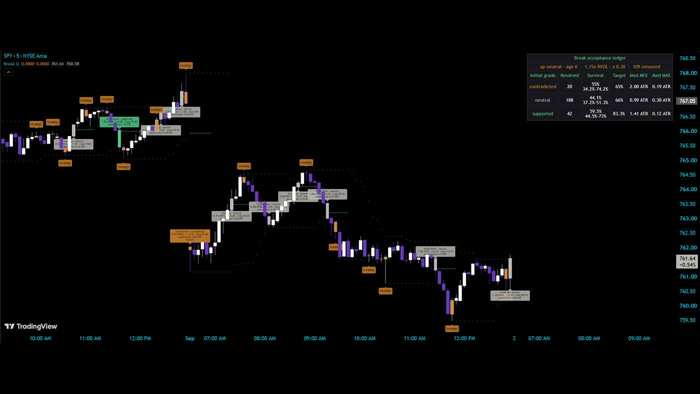
Two bars can close in exactly the same place after taking out a recent high. One is buyers absorbing supply. The other is a stop run. This keeps three claims separate instead of collapsing them into one. The event: price confirmed a close beyond a known prior level, from a rolling range or from confirmed pivots that never repaint. The grade: was the break bar supported, neutral, or contradicted by its own evidence — participation against a same-clock volume baseline, close location, penetration, and any opposing candle shape. The outcome: did price survive a fixed horizon or close back through the level. A ledger then shows, per grade, how many resolved, how many survived with a confidence interval, and the median excursion in ATR — the honest test of whether the grading is doing anything on your chart. Confirms on close, no repaint.

Plain EnglishA break tells you a level was crossed. It does not tell you who crossed it or whether they intend to stay. This reads the bar that did the crossing, then keeps watching to see whether the break held — and reports both, separately, with the sample sizes.

Break Quality on SPY 5-minute: break labels graded supported, neutral or contradicted with the volume multiple and penetration, sweep annotations, and the break acceptance ledger by grade

Replaces Break & Volume and RSI Candle Colorer, now one tool.

Get It Free on TradingView →

Ratio VWAP · Rates & vol adjusted · Lower pane · Open source · Live

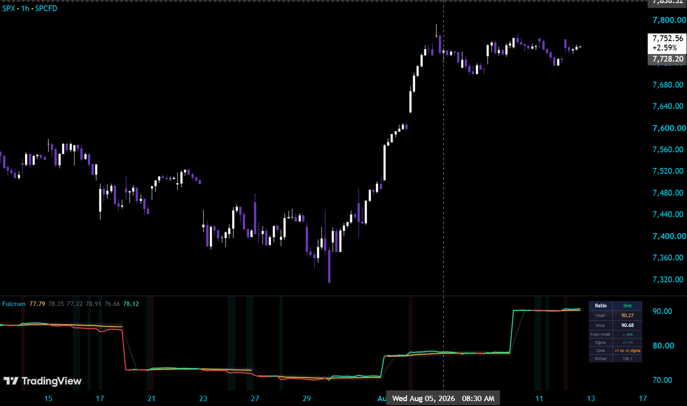
Fulcrum

AsksIs tech rich or cheap against the broad market right now?

A session VWAP drawn on the relationship between two markets instead of one. It rebuilds the NQ/ES ratio bar by bar — 2500·NQ/ES, optionally normalized by the prior session’s VXN×US10Y — weights it by the geometric mean of both legs’ volume, and anchors a session, weekly, or monthly VWAP with ±1σ and ±2σ bands on the result. Zone readout, price labels, and cross alerts included. The risk divisor uses confirmed prior-day closes only, so values match live and on reload, and it is frozen at each anchor reset so the unit stays constant across the window being averaged. It lives in its own pane with its own scale, so it drops onto any chart — ES, SPX, or the ratio itself — with nothing to configure.

Plain EnglishOne line that says whether the relationship is trading above or below its volume-weighted mean today, and how stretched the stretch is. ±2σ on a ratio behaves like ±2σ on price: somebody usually walks it back.

Fulcrum under an SPX 1-hour chart: the two-market ratio with its volume-weighted average, sigma bands, extension tint and the live zone table

Get It Free on TradingView →

Volume · Statistics · Lower pane · Open source · Live · New

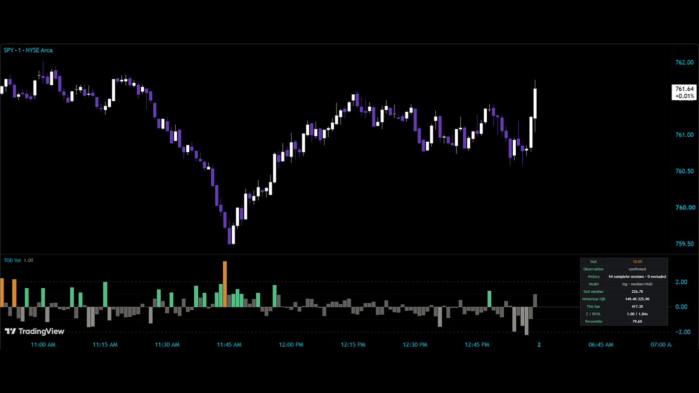
Time-of-Day Volume Normalizer

AsksIs this a lot of volume for this time of day?

Volume at 9:31 and volume at 12:30 are not the same unit. A plain moving average compares the open to lunch and calls the open a spike every single day. This compares each bar with its own clock slot across the previous sessions — the median of what this minute usually does, with a robust spread around it — and prints a z-score, a relative-volume multiple, and a percentile. Sessions enter history only when they are complete, so half days and data gaps are excluded whole and the exclusion count is shown. Log volume by default, because volume is skewed. Confirmed bars only; a live bar reads as provisional.

Plain EnglishIt answers “is this a lot of volume for 11:45?” instead of “is this a lot of volume?”

Time-of-Day Volume Normalizer under a SPY 1-minute chart: a z-score histogram against the same-clock baseline and the panel reading slot, history, model, slot median, this bar, RVOL and percentile

Get It Free on TradingView →

Volatility · Statistics · Lower pane · Open source · Live · New

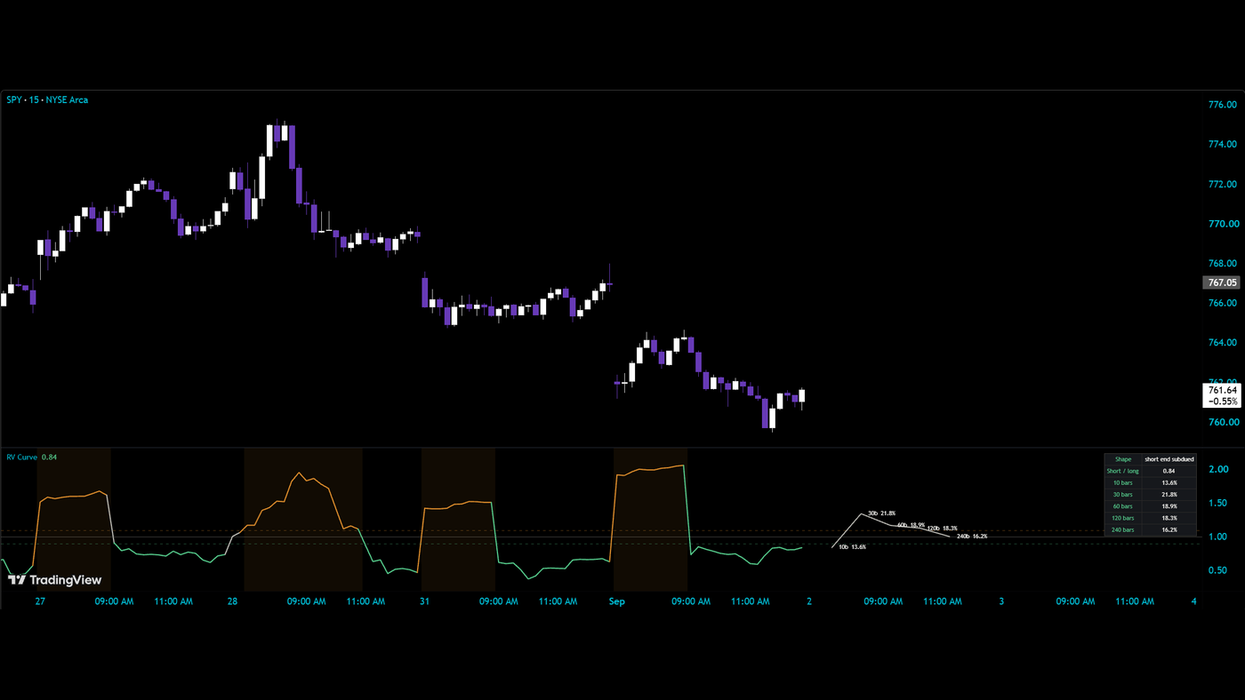
Realized Volatility Term Structure

AsksIs the short end of volatility hot or cold right now?

Realized volatility measured over five windows at once — 10, 30, 60, 120 and 240 bars — annualized for the chart you are on and drawn as a curve so you can see its shape: short end elevated, flat, or subdued against the long end. The pane plots the short-to-long ratio through time; the table reads the whole curve at once. A description of what has already happened, not a forecast of what comes next.

Plain EnglishRecent bars have been wilder than the longer baseline, or calmer. The shape says which, and by how much.

Realized Volatility Term Structure under a SPY 15-minute chart: the short-to-long ratio through time with elevated stretches shaded, the five-window curve drawn to the right, and the table reading short end subdued

Get It Free on TradingView →

Sessions · Volume · Statistics · Overlay · Open source · Live · New

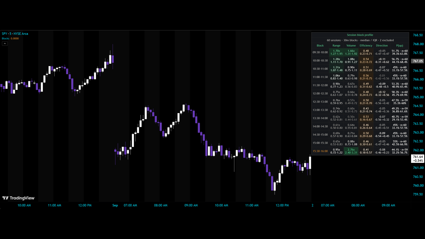
Session Block Profile

AsksWhat does 10:30 to 11:00 usually look like?

The regular session cut into equal clock blocks — 30 minutes by default — and profiled across the last N complete sessions: range and volume as a multiple of that day’s own typical block, efficiency (how much of the range the body actually traveled), signed direction, and the share of blocks that closed up, with a confidence interval. Every session is normalized before it enters history, so one wild day cannot dominate the profile. Sessions are committed only when every expected bar is present. An optional marker and alert fire when a historically active block begins — a time-of-day notification, not a direction call.

Plain EnglishA clock-time map of when this instrument usually moves, usually trades, and usually chops.

Session Block Profile over a SPY 5-minute chart: block boundaries shaded through the session and the table reading range, volume, efficiency, direction and P(up) for every 30-minute block across 60 sessions

Get It Free on TradingView →

Support & Resistance · Statistics · Overlay · Open source · Live · New

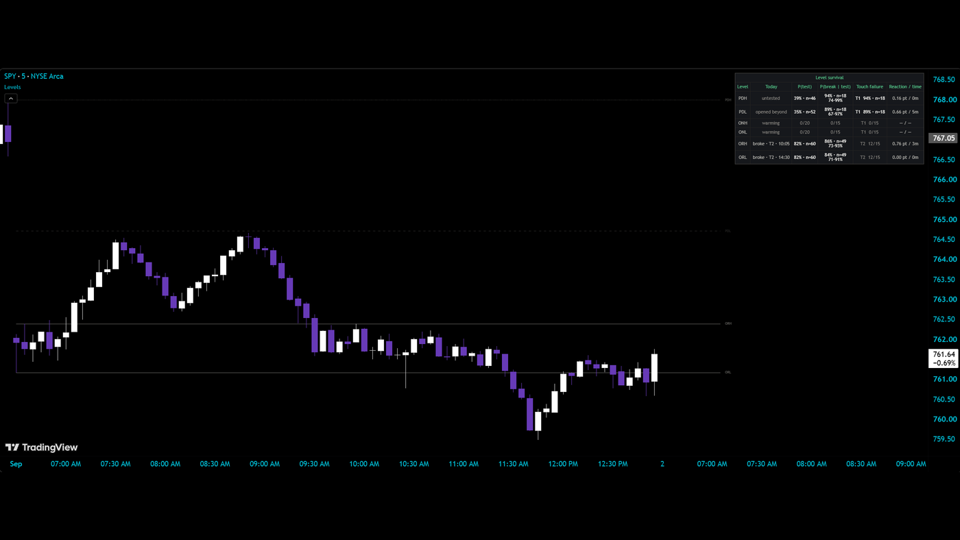
Level Survival Tracker

AsksWhen price reaches yesterday’s high, what usually happens next?

Six levels every intraday trader draws — prior-day high and low, overnight high and low, opening-range high and low — tracked as statistics instead of lines. For each: how often it gets tested at all, how often a test turns into a break with a confidence interval, how often the first touch fails, and the median reaction and time-to-break. Today’s row states what the level has done so far: untested, tested, broke, or opened beyond. Tolerance in ticks, points or ATR; optional conditioning on gap and volatility regime. Confirmed bars only.

Plain EnglishNot “PDH is resistance.” Rather: how often PDH gets tested, how often a test breaks, and how sure the sample lets you be. The number, with its uncertainty, instead of the folklore.

Level Survival Tracker over a SPY 5-minute chart: prior-day, overnight and opening-range levels drawn, and the table reading today, P(test), P(break given test), touch failure and reaction time per level

Get It Free on TradingView →

Statistics · Candles · Overlay · Open source · Live · New

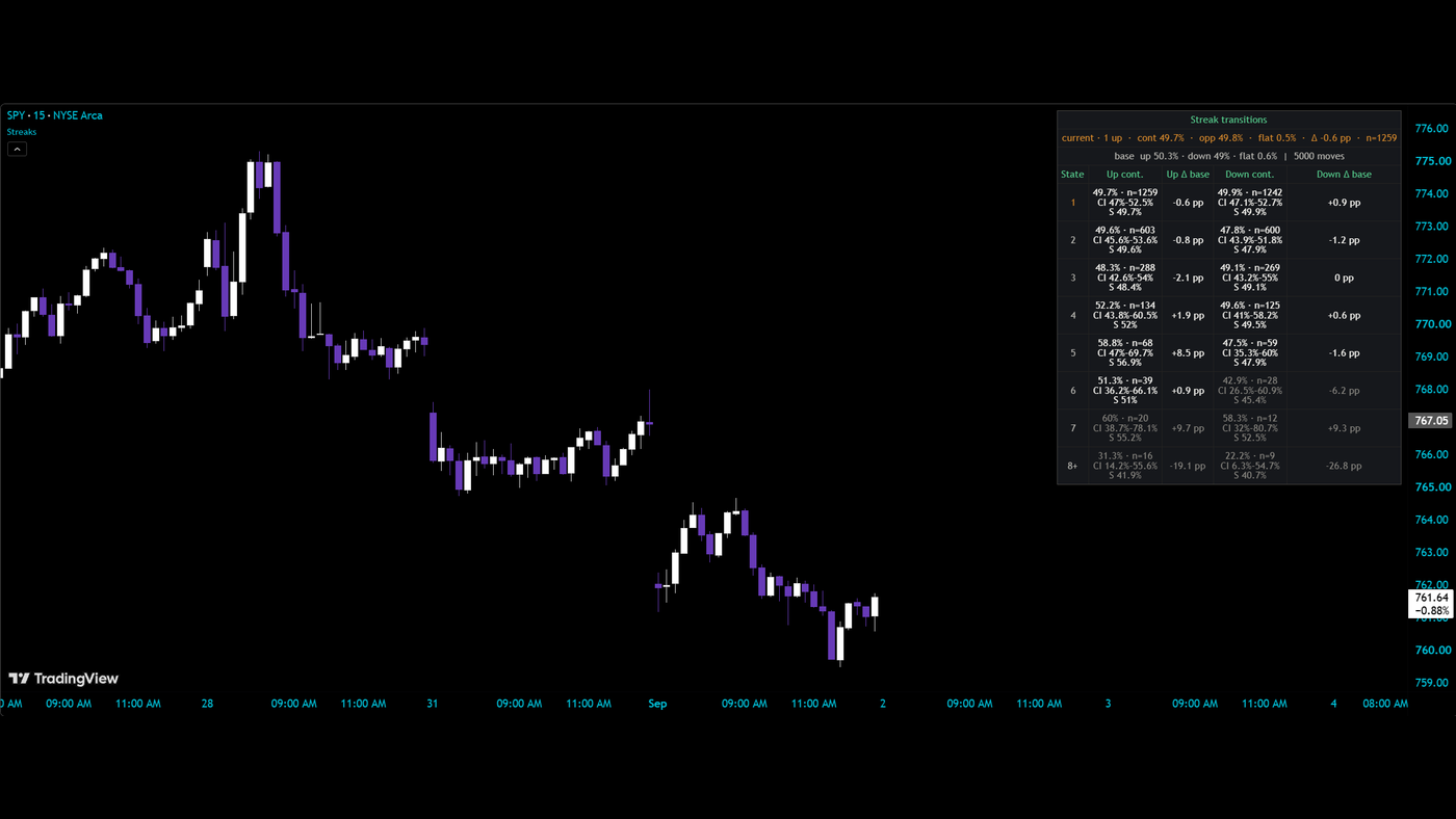
Streak Statistics

AsksAfter four up bars in a row, does the fifth care?

Every run of consecutive up or down closes, counted exactly. For each streak length: the share of the time the streak continued versus reversed, with a confidence interval, a stabilized estimate for thin rows, and the lift against the base rate. Rows below the minimum sample are muted; a material, interval-separated departure from base is emphasized in either direction. Streaks can be censored at the session or calendar boundary so an overnight gap does not fabricate a run.

Plain EnglishIt counts what actually happened after streaks like this one, on this chart, and tells you how sure it is. Usually the honest answer is “about the base rate” — which is itself worth knowing.

Streak Statistics over a SPY 15-minute chart: the transitions table reading continuation share, confidence interval, stabilized estimate and lift against base for each streak length, up and down

Get It Free on TradingView →

For thinkorswim · thinkScript

Install any tool: Studies → Edit Studies → Create → paste the file → apply. Every chart zooms on tap. The courtroom set: every tool below is named for the moment it rules on.

RSI · Entries · thinkorswim · Open source · Live

Redirect

AsksIs that RSI signal worth a follow-up question?

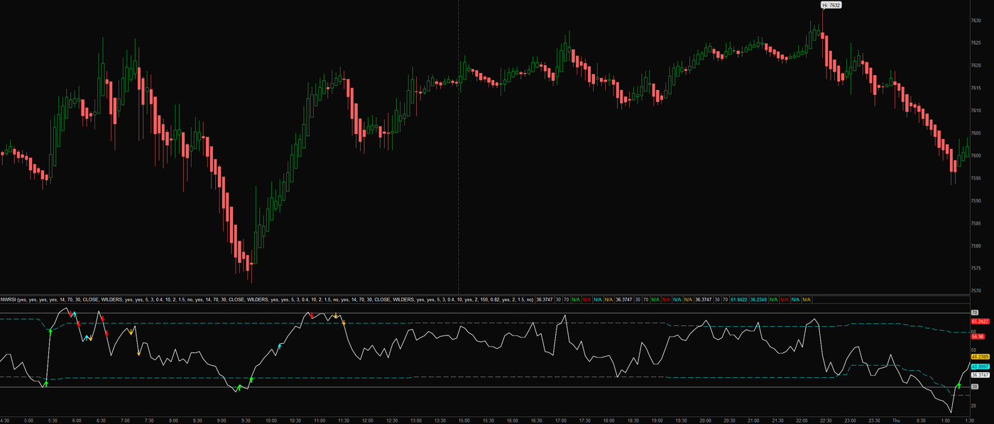
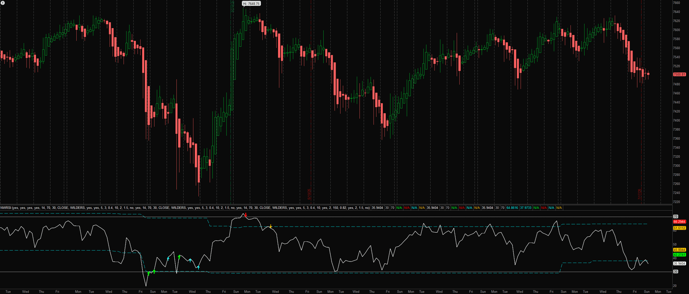
After Cross-Examination comes redirect, the follow-up question. Base arrows print when RSI reclaims its rails, strictly (a real visit first) or on a momentum snap. Then the part most RSI tools skip: Redirect waits for the pullback that holds, the higher low in RSI after a buy signal, the lower high after a sell, and prints the entry arrow. Rails can be fixed 70/30 or adapt to the RSI’s own recent range, with a confirmation mode that only speaks when both agree. Consolidated from a triple-engine original into one honest instrument.

Plain EnglishGreen and red arrows say the stretch is over. Cyan and orange arrows say the first pullback held, which is the higher-quality moment. The dashed cyan rails learn what overbought means for this market instead of assuming 70.

Redirect on an ES 5-minute chart: RSI with fixed and adaptive rails, base arrows at the reclaims and cyan and orange follow-up entries on the pullbacks that held Redirect on an ES 4-hour chart across months: sparse base signals at genuine extremes with follow-up entries clustering at the turn

Download the thinkScript →

Extremes · Gauges · thinkorswim · Open source · Live

Closing Argument

AsksDid fear just spike past normal?

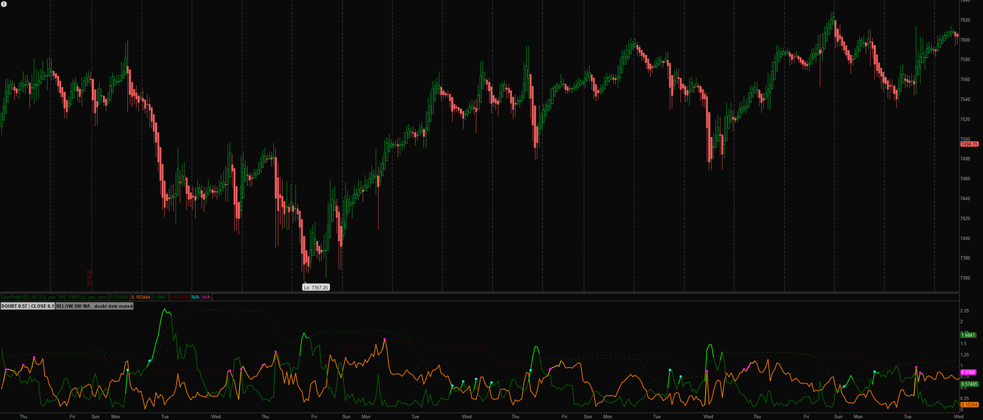
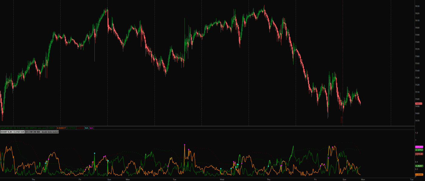
Two gauges built on Larry Williams’ published Synthetic VIX concept, run in both directions and implemented from scratch in-house. The DOUBT gauge spikes when price craters below its recent high-water mark, the neighborhood of capitulation lows. The CLOSE gauge is its mirror, spiking when price stretches euphoric above its low-water mark, historically where positions get wrapped up. Each carries its own statistical band, dots stamp the bar a spike begins, and a trend filter mutes fear-buying dots below the 200 average. When the crowd starts shouting, this rests its case.

Plain EnglishGreen measures panic, orange measures greed. Either one crossing its dashed band means the crowd just hit a statistically unusual extreme, and extremes are where turns are born.

Closing Argument on an ES 1-hour chart: the green doubt and orange close gauges cycling under their statistical bands with spike dots at the extremes, the status label reading both gauges Closing Argument on ES 15-minute: euphoria spikes in orange marking local tops through a two-week selloff while doubt dots stay muted below the 200 average

Download the thinkScript →

Volatility · MTF · thinkorswim · Open source · Live

Statute

AsksIs this week’s move already spent?

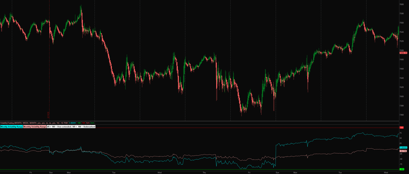
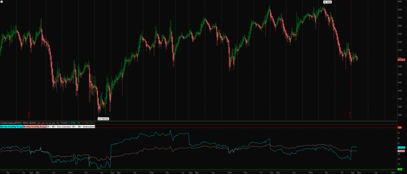
Every week and every month gets an allowance: the prior period’s smoothed true range, centered on the current open. Statute measures how much of that allowance price has already spent, on both clocks at once, normalized so plus and minus 100 are the rails. Beyond the statute, price is operating outside the law of its own volatility: over-extended above, undervalued below, with the breach shaded. Not a fear gauge; a range budget. Different question, different tool.

Plain EnglishIf a normal week moves ten points and price has already moved twelve, the weekly line crosses the +100 rail. Stretched markets tend to rest or snap back; this shows the stretch on the week and the month at a glance.

Statute on an ES 15-minute chart: weekly and monthly volatility range lines with a deep undervalued stretch pinned near the minus 100 rail before recovering Statute on an ES 1-hour chart across a month: the weekly line cycling between the rails while the monthly line holds mid-range

Download the thinkScript →

Structure · Zones · thinkorswim · Open source · Live

Exhibit A

AsksWhere did the last breakout build its case?

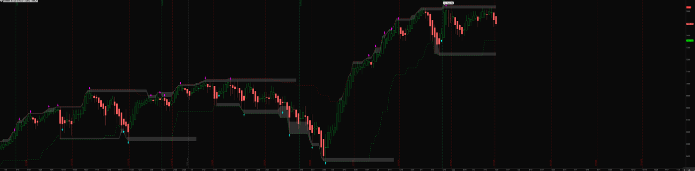
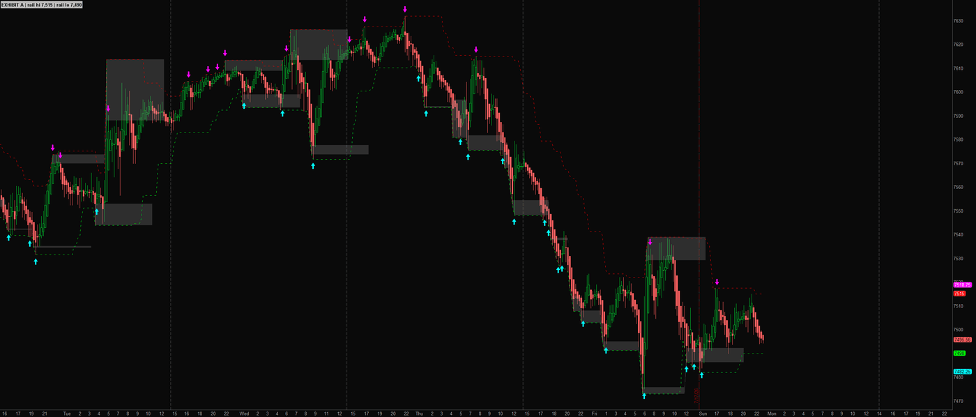
Price-action structure, entered into evidence. Rolling swing highs and lows print as stepped dashed rails, and every meaningful new extreme stamps a shaded gray zone: the exhibit, where price built its case before it moved. Arrows are deliberately rare and close-confirmed, printing once per violation when price wicks through a rail and then closes back inside. A wick is testimony. A close is evidence.

Plain EnglishThe dashed steps are the highest high and lowest low of the last stretch. The gray boxes mark where a real breakout was born. Old boxes tend to matter again when price comes back to visit.

Exhibit A on an ES daily chart across a year: stepped structural rails with shaded zones stamped at each major breakout and sparse confirmed reversal arrows Exhibit A on an ES 15-minute chart: gray structure zones and rail reclaims through a two-week selloff, arrows printing only on confirmed closes

Download the thinkScript →

Swings · Leg counter · thinkorswim · Open source · Live

For the Record

AsksIs this pullback the trend breathing, or breaking?

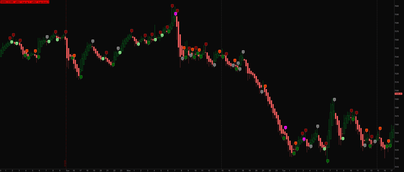
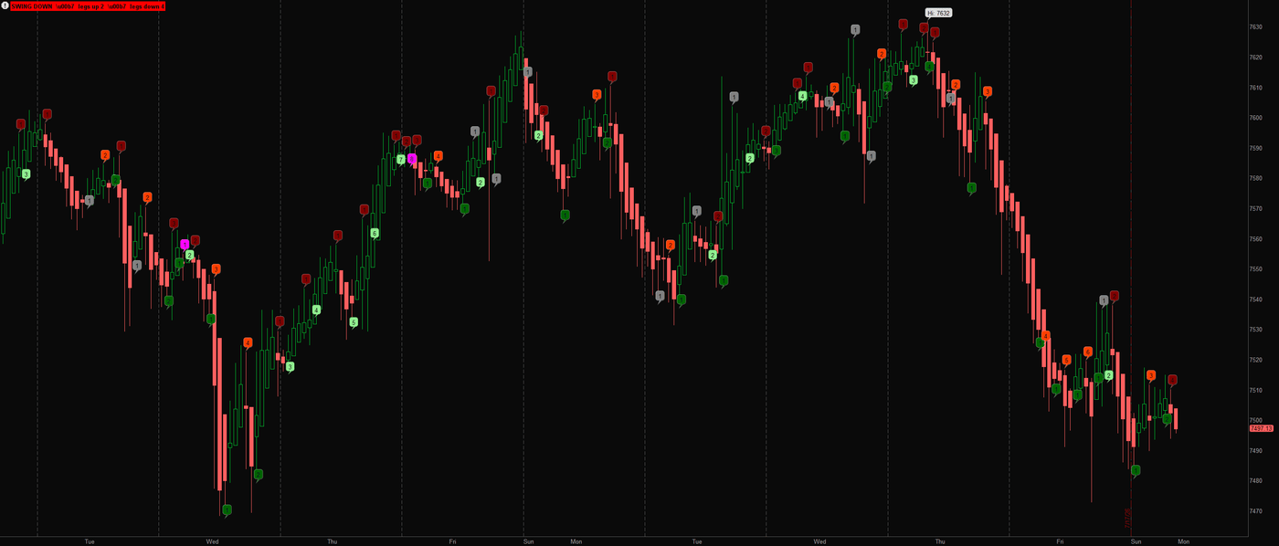
A bar-by-bar swing state machine that enters every leg into the record: trend flips on a higher high or lower low, each completed leg gets a numbered bubble at the turn, and higher lows keep the up-count alive while lower highs keep the down-count. It is built for reading the classic two-legged pullback, where the second leg into support with a failed break is the tell, and when a leg fails to extend past the prior pivot, the bubble turns magenta. Objection, sustained.

Plain EnglishIt numbers the market’s zigzags. A pullback that makes two lower stabs and fails to break the old low is often just the trend catching its breath, and this makes that pattern countable at a glance.

For the Record on an ES 15-minute chart: numbered swing-leg bubbles through a selloff and recovery, with failed-break turns in magenta For the Record on an ES 1-hour chart: leg counts tracking a full week of swings with the status label reading the current swing state

Download the thinkScript →

Trend · Moving averages · thinkorswim · Open source · Live

Cross-Examination

AsksWhich average is winning the argument?

The oldest trick in the book, done properly: a fast and a slow average, a cloud colored by who is winning the argument, and arrows when the fast line overtakes the slow one under questioning. Two upgrades most versions skip: arrows can wait for the candle to close (on by default) so an intrabar wobble cannot paint and then erase them, and the alerts say actual words. Every platform ships a crossover. Fine. Ours closes its arguments.

Plain EnglishTwo averages of price, one quick and one slow. Quick above slow, the trend leans up. Quick below, it leans down. The cloud makes the lean visible from across the room.

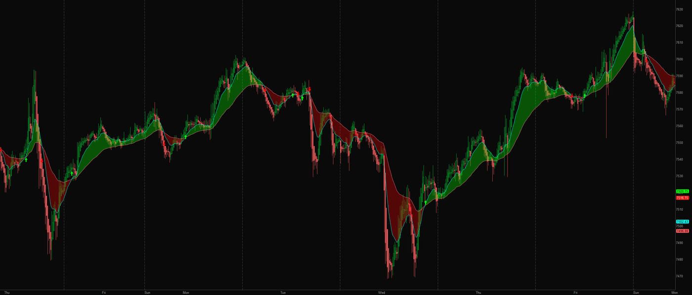
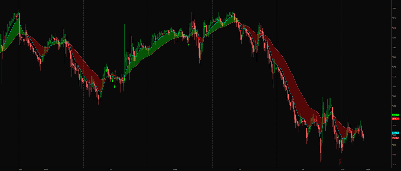
Cross-Examination on an ES 15-minute chart through a choppy multi-day stretch: the 13 and 48 EMA cloud flipping green and red with confirmed cross arrows Cross-Examination on ES 15-minute through a trending week: one long red cloud carrying the selloff, arrows only at the genuine crossings

Download the thinkScript →

S/R · Pivots · thinkorswim · Open source · Live

Precedent — Projection Pivots

AsksWhich old levels is price still sworn to?

Past pivots are precedent, and price gets judged against them. This finds confirmed pivot highs and lows, extends the latest ones forward as dashed support and resistance, and projects trendlines through the last two of each, the dashed lanes where the market has been overruled before. One honesty note we insist on: a pivot only exists after its strength bars print on both sides, so new pivots appear with hindsight. What never happens: a confirmed level moving. Once precedent is set, it is carved.

Plain EnglishIt marks the last real swing high and swing low and draws lines from them into the future. Price approaching those lines is price approaching a place it reversed before.

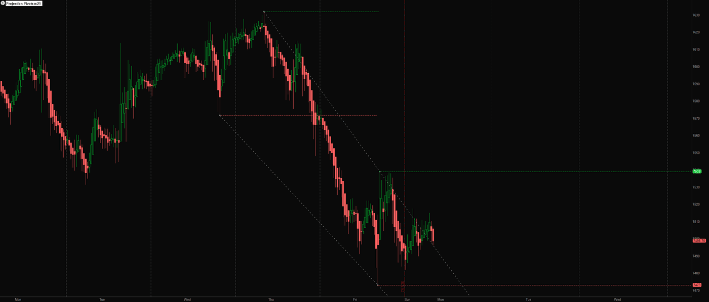
Precedent on an ES 30-minute chart: confirmed pivot levels extended as dashed support and resistance with projected trendlines through the last two pivots

Download the thinkScript →

ORB · Breakouts · thinkorswim · Open source · Live

Opening Statement (ORB)

AsksDid the first fifteen minutes mean it?

The market makes its opening statement in the first fifteen minutes. This holds it to it: the opening range prints as session-long high and low rails, breakouts only count on a close beyond the level (a wick poke is an objection, not a verdict), retests of the broken level get their own marks, and every signal fires once per side per day. Optional measured targets from the range width. Cross-examine it on your own tape.

Plain EnglishThe first 15 minutes set a box. Price closing above the box is strength; closing below is weakness; coming back to touch the box edge and holding is the market keeping its word.

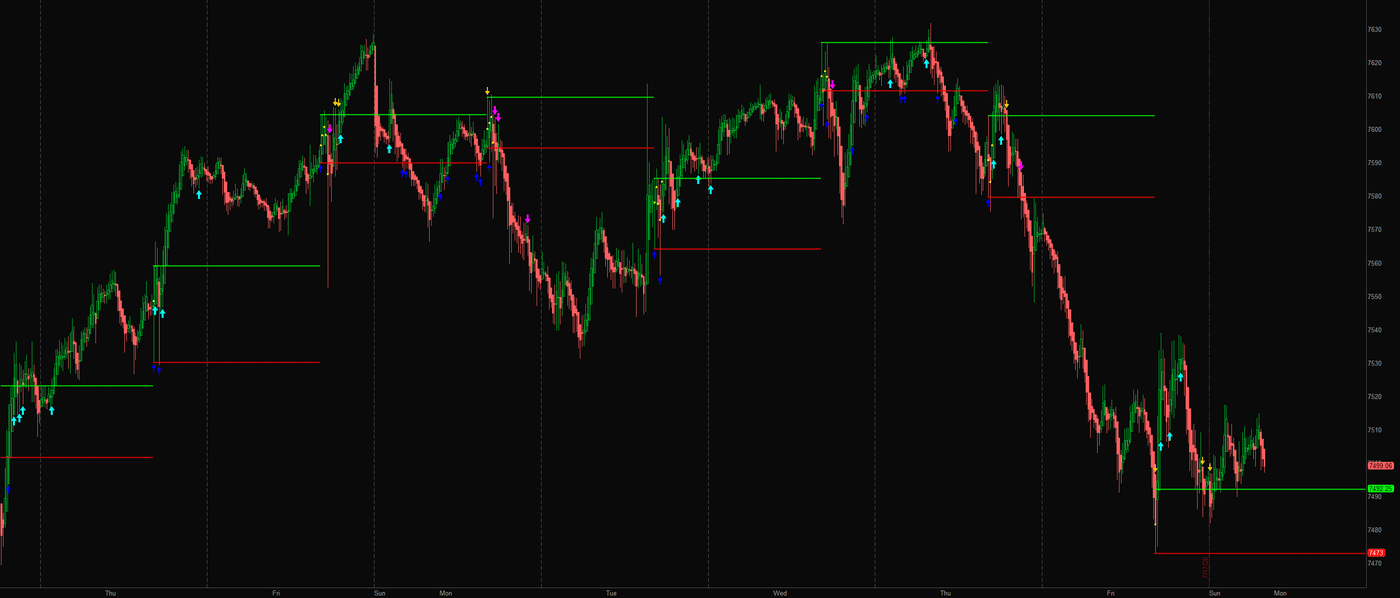
Opening Statement on an ES 15-minute chart across a week: daily opening-range rails in green and red with confirmed breakout and retest arrows

Download the thinkScript →

Futures · Order flow · thinkorswim · Open source · Live

Dual-Tape Pressure

AsksAre ES and NQ telling the same story?

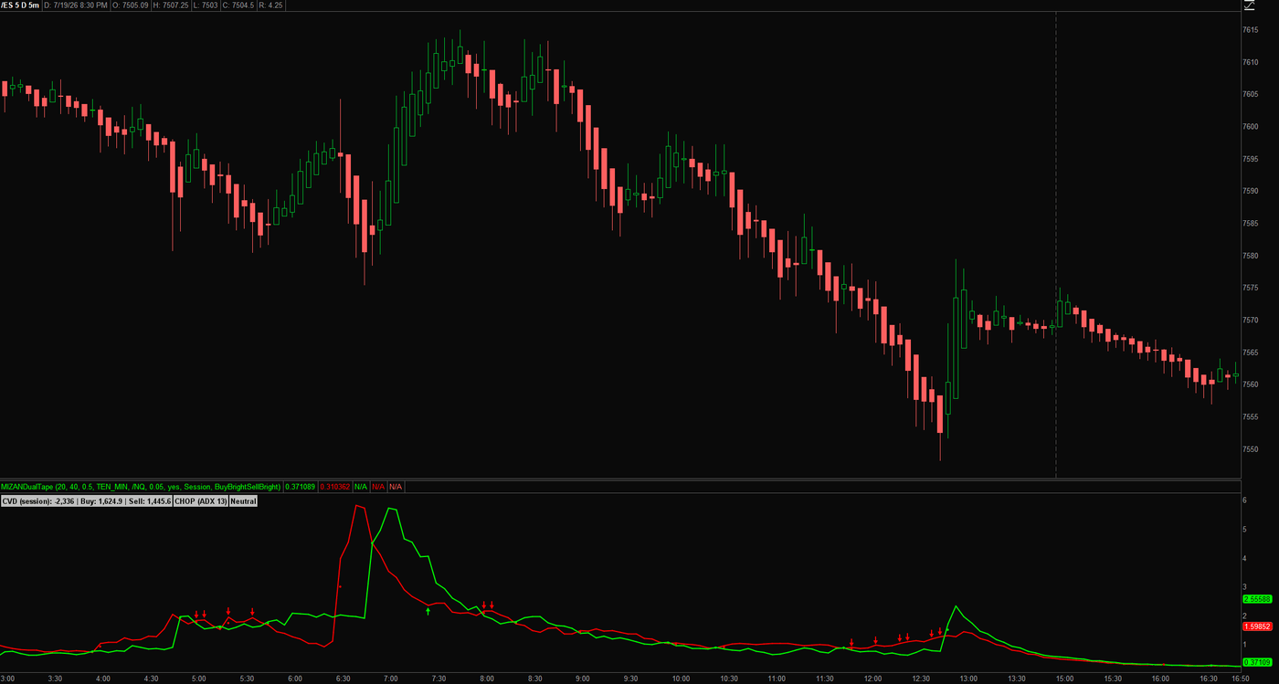
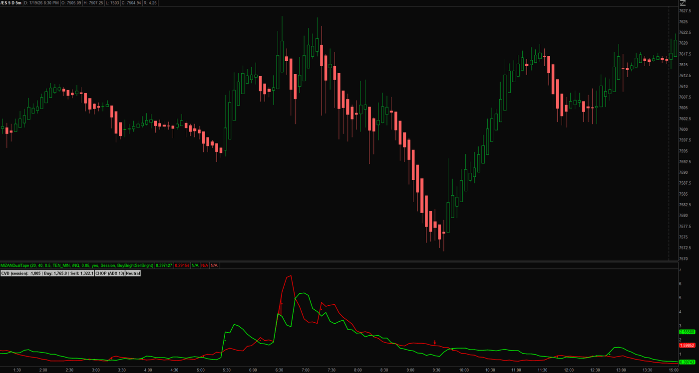
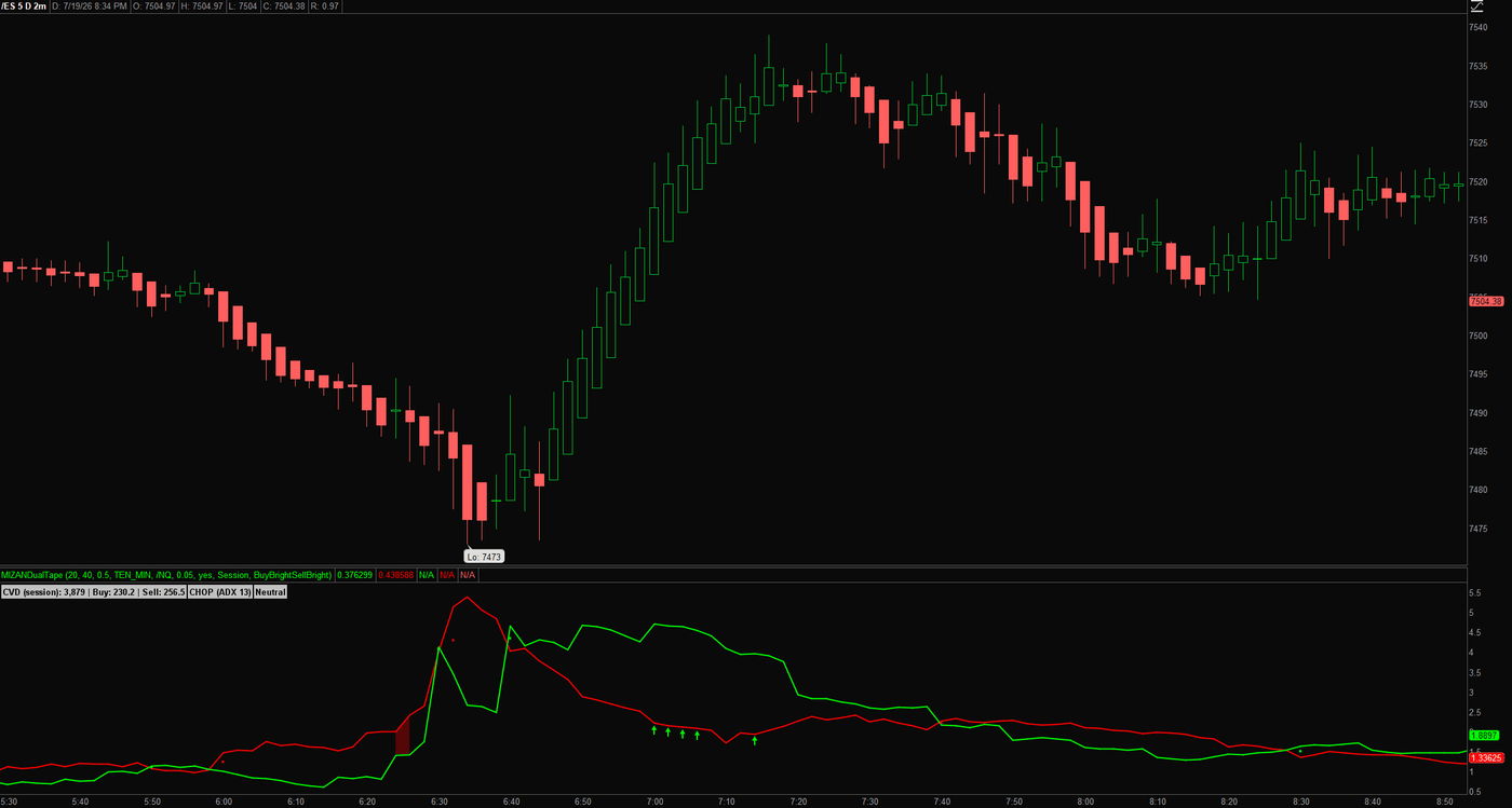
Our first thinkScript release, because the balance doesn’t care which platform you weigh on. It reads volatility-adjusted buy and sell pressure on your chart symbol and a second instrument at once (ES and NQ by default), on two timeframes, gated by a proper Wilder ADX trend read. Arrows print only when every reading agrees, and a label reports the bias plus a session-anchored CVD. It will not tell you to buy a call. It will tell you who is winning.

Plain EnglishIt watches the S&P and Nasdaq futures at the same time, on two clocks, and only marks a side when all of them agree. One holdout, no arrow.

MIZAN Dual-Tape Pressure under an ES 5-minute chart: buy and sell pressure lines with the session CVD, ADX regime label, and confirmed-print arrows across a full day Dual-Tape Pressure on ES 5-minute: sell pressure spiking into the open, then the buy line taking the tape through the crossover Dual-Tape Pressure zoomed on an ES 2-minute chart: a cluster of confirmed buy prints as pressure flips green off the session low

Download the thinkScript →

Bands · Regime · thinkorswim · Open source · Lite build

Blended Math Genius Average

AsksWhat regime is the tape in right now?

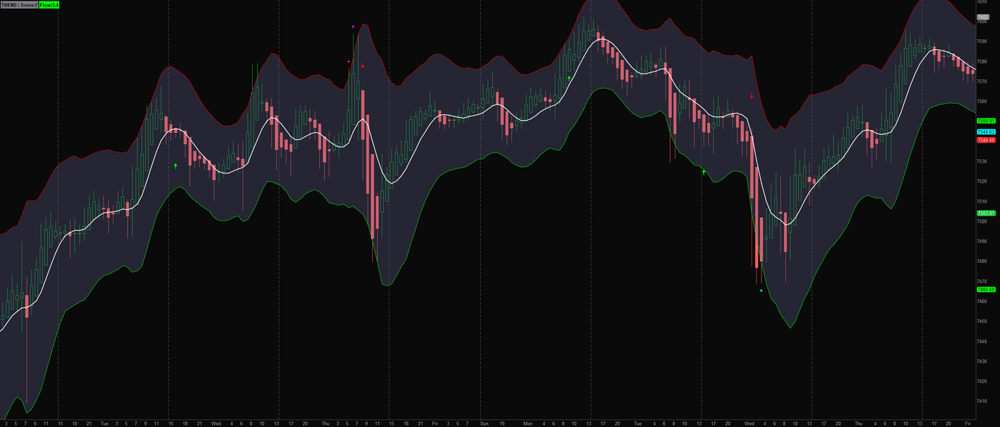
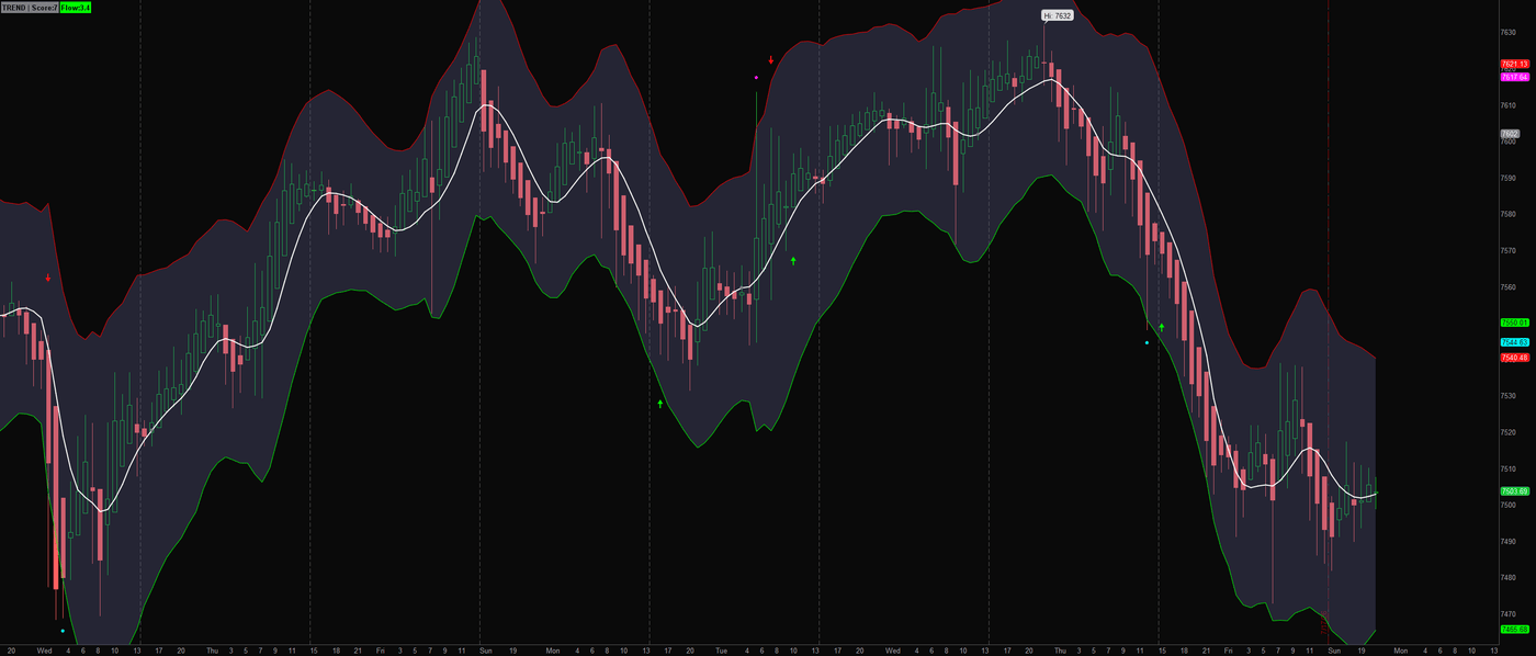
Yes, that is really what it’s called. Somewhere during development, modesty left the building. This is the Lite build: a blended dual-kernel midline, a volatility envelope that breathes with the tape, regime and flow labels, transition arrows, and band-touch markers, all running on straightforward public math you can read line by line. The full version’s adaptive internals are the same family the paid engine grew from. Lite is the free sample; the proprietary internals stay proprietary.

Plain EnglishA steady blended line with a band that breathes with volatility. Wide band, be careful. Calm tape, tighter band. Dots mark band touches worth a look.

Math Genius Lite on an ES 1-hour chart: blended midline with the breathing envelope, TREND and Flow labels, and band-touch dots Math Genius Lite on ES 1-hour: the envelope widening through a selloff and tightening as the tape calms

Download the thinkScript →

More coming

The workbench grows.

More free tools are on the way. Follow the TradingView Profile to catch each release, or read the weekly Regime Read on the main page. New tools ship when they’re ready, which is a promise disguised as a schedule.

Why give tools away? Because “trust me” is not an argument — open code is. Read it, test it, keep it. If the free work is this careful, you already know how the paid engine is built.

The free tools show you how we think. The engine is not their sum.

Every tool on this page is one honest read, and you could load all of them at once. You would have a screen full of opinions and no verdict. MIZAN is not these tools combined: its 7 validation layers are proprietary, built to agree or say nothing, fused into a single 0–100 score that blocks the weak setups before they reach you. The workbench shows the philosophy. The engine is the instrument.

Test it on your tape — 7 days free

7-day free trial · Cancel anytime · Secure checkout on Whop

The Regime Read

Took a tool? Take the read.

One email a week: where the score sat on ES and SPY, what the stack blocked, and the one setup that mattered. Written by the builder, not a funnel.

Free. No spam. Unsubscribe anytime. Still no email wall on the tools; this is optional.